The new broker apps have done relatively well displaying aggregated information. It displays the XIRR (Extended Internal Rate of Return). Which is a fair number. That number gives you a snapshot of your return %. It accounts for when each rupee went in, and tells you how the whole portfolio is doing.
The thing is, it blends everything. The money that you have put 4 years ago, and the one you did last month sit in the same average. Nothing is terribly wrong with that, but I wanted to go one level deeper. If the old money is doing relatively well and the new one is struggling (or the other way around) - there is no way you can find that.
I wanted to separate this. And bucket investments based on their holding period. While at it, I also wanted to check would the same money have done better being invested in a plain Nifty 50 index fund?
Ground rules
This also isn’t about investment strategy. No views on what to buy, what to hold, or how anyone should invest. It’s an exercise in slicing my own data a different way, mostly to keep the analytical part of my brain busy on a weekend.
Method and assumptions
- Each purchase is grouped by how long ago I made it: under 1 year, 1 to 3 years, 3 to 5 years, and 5 years plus (I don’t have any funds in the last category yet).
- Only units I still hold are counted. Anything I have sold is out of the picture.
- If I sold something and reinvested, or switched from one fund to another, the new purchase counts as a fresh investment from that date.
- For the comparison, each purchase is replayed into a Nifty 50 index fund on the same date, with the same amount. Same money, same timing, just a different fund.
(If this replay sounds familiar, private equity folks call it a Public Market Equivalent. I just borrowed it.)
Where the money sits right now
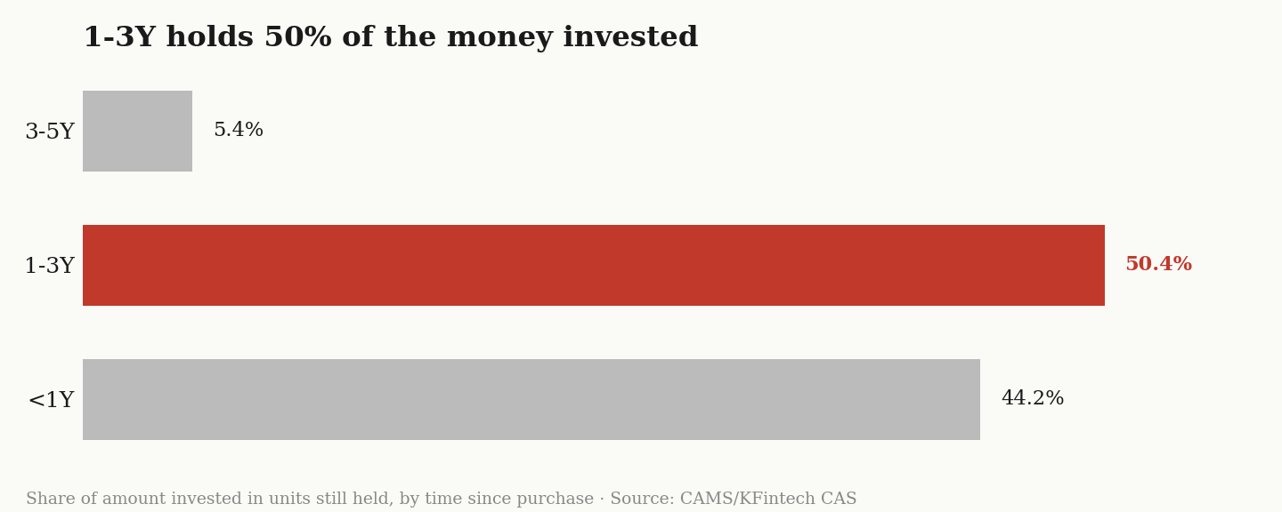
In terms of age bucket - where does the money sit right now?
Okay. Now two views.
All funds vs the Nifty 50
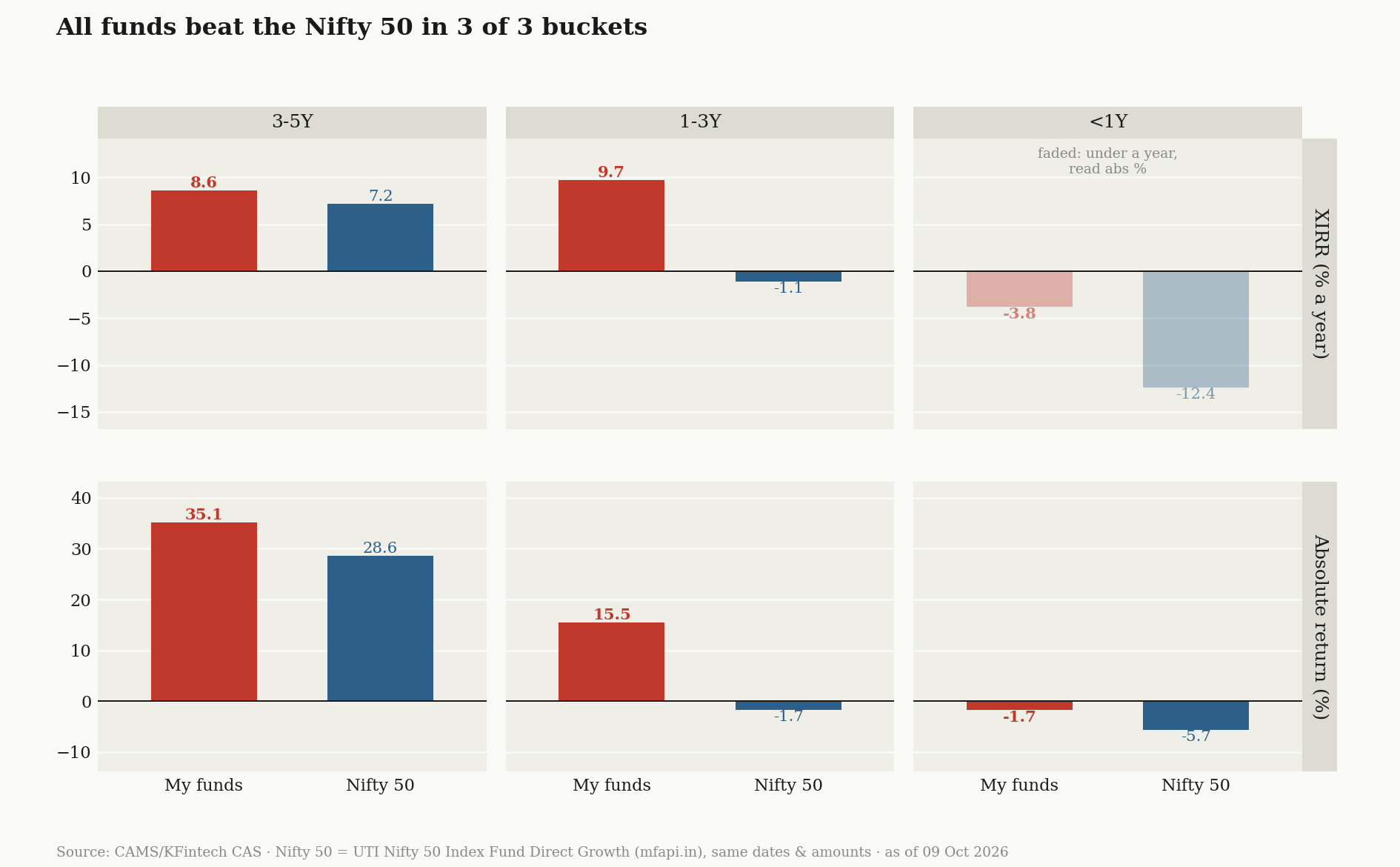
Here we see how the investments have performed for each bucket vs Nifty 50.
Equity only vs the Nifty 50
The all-funds comparison isn’t quite fair. Part of my portfolio is in debt and gold, which were never meant to keep pace with the Nifty, so here they are taken out.

Similar like the other view, but only equity funds.
Why the under-a-year bars are faded
XIRR annualises. It takes whatever return you’ve made and asks what that would be over a full year. For money invested a few months ago, that turns small moves into silly numbers: a 5% gain in three months shows up as roughly 22% a year. So for the newest bucket, I read the absolute return in the bottom row and mostly ignore the faded XIRR bars above it.
I am not adding any additional commentary on the numbers or where I have invested. The goal here was to just do this analysis.